Racial Shifts
San Francisco’s socioeconomic disparities are present at a racial level, and can be seen spatially. However, as Dreier, Mollenkopf and Swanstrom point out in their chapter “The Facts of Economic Segregation and Sprawl,” contemporary urban theorists have debated the extent to which racial or economic forces have more significantly shaped our racialized urban landscapes. Many, like prominent academic William Julius Wilson, contend that economic structure is more to blame than racism [5]. However, when translated to San Francisco housing and school system policy, the city has found that acknowledgment of race still plays an integral role in spatial desegregation. In certain cases, when leaders in these two domains took less strong stances on race, more racial segregation occurred.
Maps below show how certain racial & ethnic groups have spatially clustered in the past 30 years. |
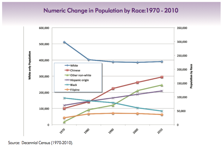
From 1970-2010, white and black populations have decreased in San Francisco, while Chinese, Hispanic, Filipino, and other non-white ethnic groups have increased in population. (Source: From Urban Renewal and Displacement to Economic Inclusion: San Francisco Affordable Housing Policy, 2012)
|
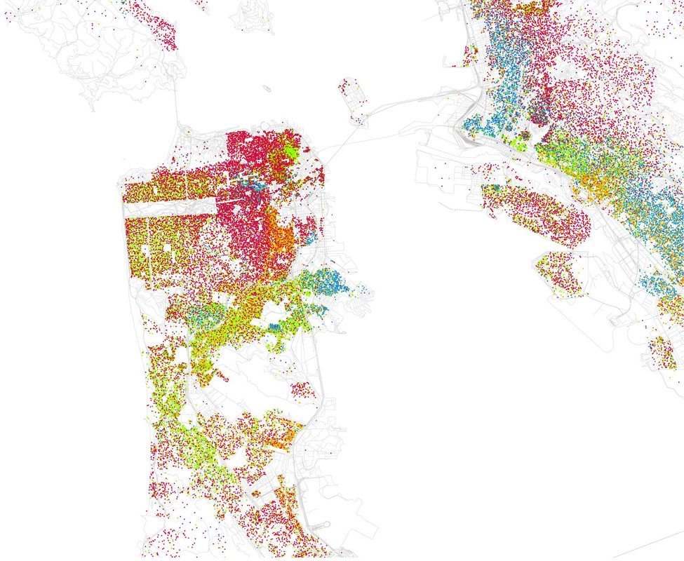
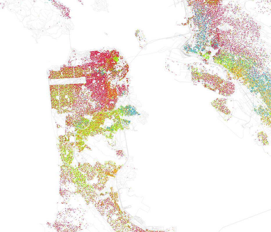
These two maps compare spatial distributions of racial groups in the Bay Area, based on 2000 (left) and 2010 (right) Census data. Pockets of color reveal neighborhoods traditionally associated with a particular racial or ethnic group—the green cluster in the top northeastern corner is Chinatown; the orange on the lower eastern side shows the Mission District, with its strong Latino population; and the two blue clusters identify the Western Addition (northeast) and Bayview-Hunters Point (southeast), two historically black neighborhoods.
Key: Red - White, Blue - Black, Green - Asian, Orange - Hispanic, Gray - Other. Each dot is 25 people. (Source: Flickr, Eric Fischer)
Key: Red - White, Blue - Black, Green - Asian, Orange - Hispanic, Gray - Other. Each dot is 25 people. (Source: Flickr, Eric Fischer)
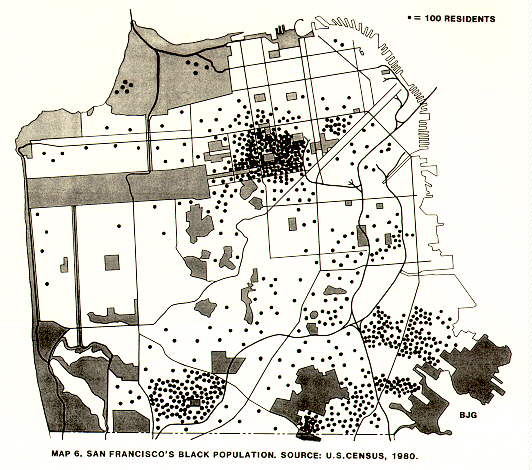
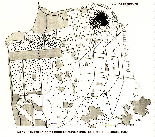
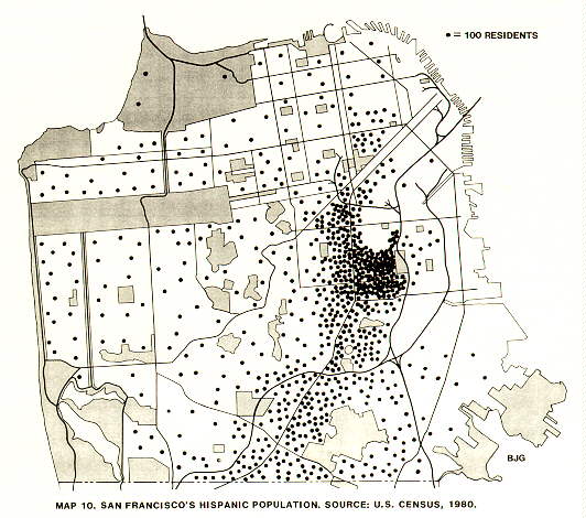
Compare the colored 2000 & 2010 maps with these race/ethnicity-specific maps from 1980. Each dot represents 100 residents. (Source: http://www.zpub.com/sf/sf-pop.html)
