Evolution of City Land Use
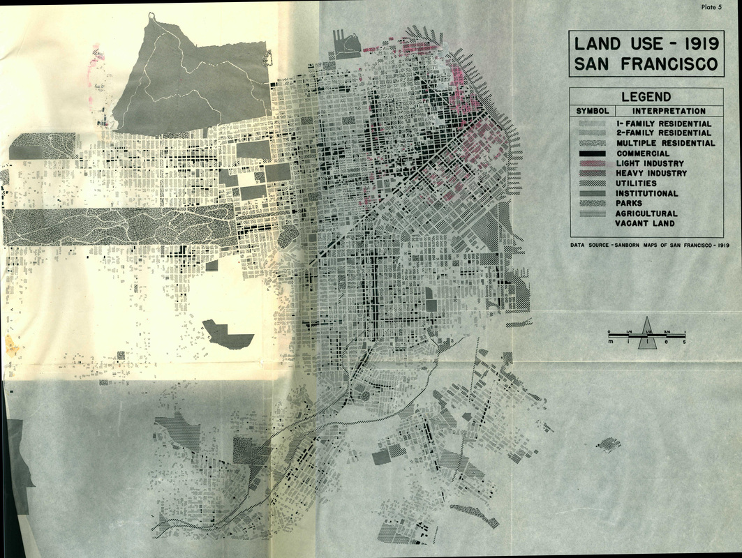
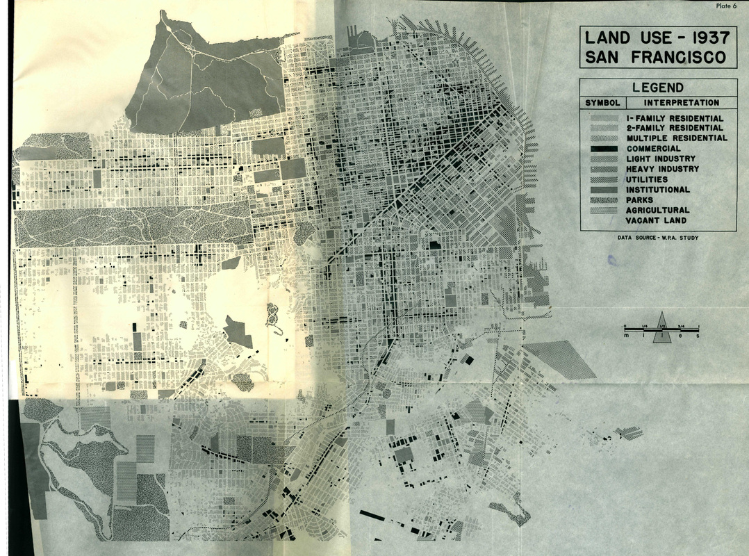
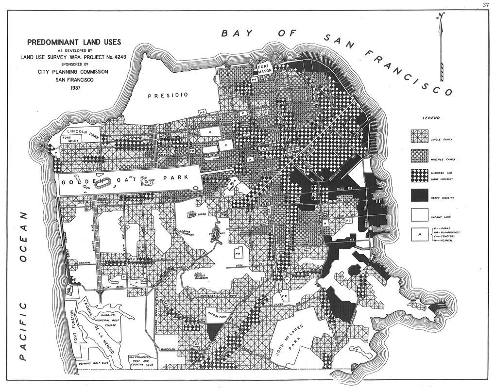
The maps below show San Francisco’s land use patterns in the early 20th century. San Francisco was not fully built out in any of these years—most notably in 1919, where large portions of land in the western region are not developed. Again, the hills in the midwestern part of San Francisco likely slowed development. By 1937, single family housing had sprung up around the hills as the dominant land use in the west side of the city. The darkest sections in the 1919 map indicate commercial areas, making the central business district along Market Street highly visible. Again, this commercial core is located in some of the lowest lying area of the city. Light industry (pink in the 1919 map, and combined with commercial in the 1937 Traffic Survey map) helps fill in this core area. Unlike the 1919 map, the darkest areas in the 1937 Traffic Survey map show heavy industry. Again, these kinds of businesses necessarily located in flatter areas to accommodate the scale of manufacturing and other port-related shipping activities. This lower east area boomed shortly after 1937, with World War II’s demand for war-related manufacturing.
Scroll over images for more information; click to make the images larger.
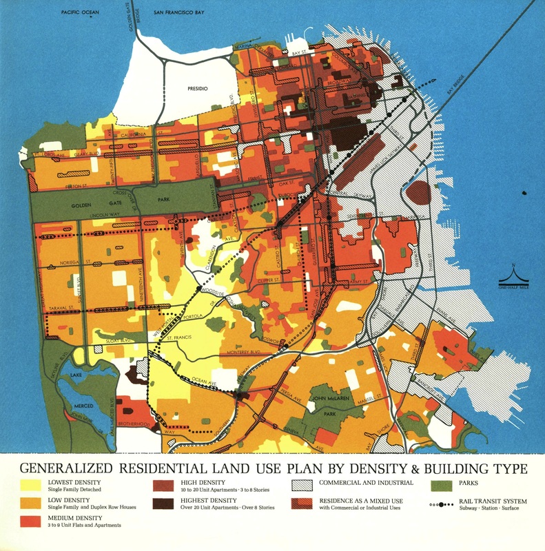
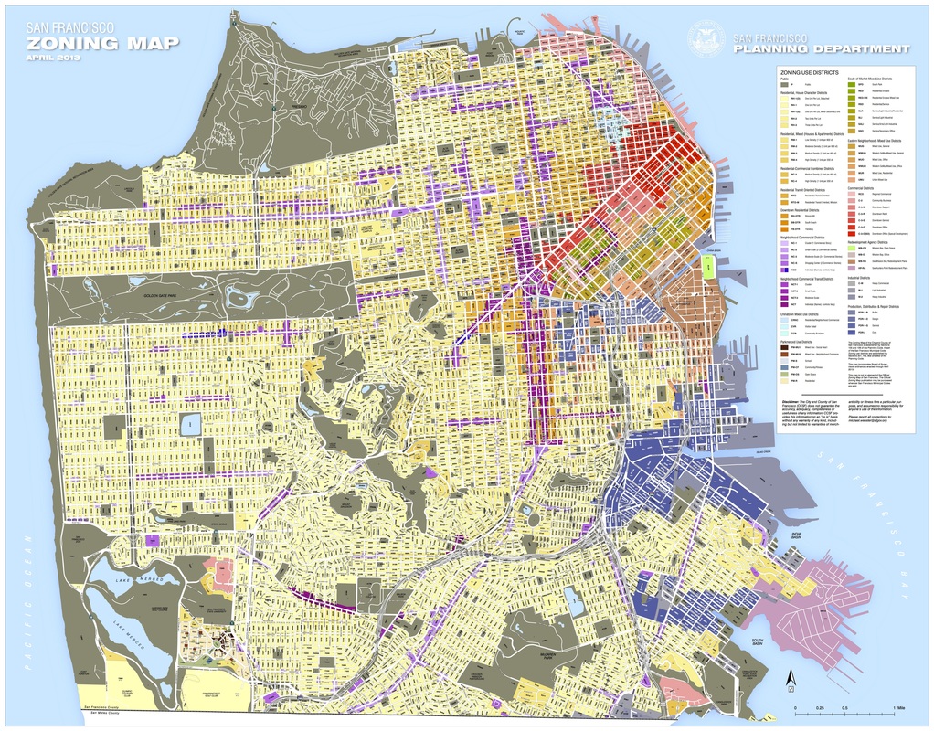
These two maps illustrate San Francisco’s land use, after it reached development capacity in the 60s. Neither map is a traditional land use map. The one from 1971 exclusively represents residential land use planning, and the current map is a zoning map. This is because the city’s contemporary planning department has created localized land use maps by neighborhood, as part of their efforts to plan at a more micro, neighborhood-level. Even so, these maps show that land use patterns have largely followed the trends set out in the late 19th/early 20th centuries. High density living is concentrated downtown, near the central business district and along Market Street, while residential density has almost spread out in a gradient from there. The city cannot accommodate too much of the lowest density residential (shown in the 1971 map as light yellow), and for that reason, one sees very few single-family detached home districts in both maps. Looking closely at the current zoning map, much of the yellow gradient is actually zoning for multiple units per lot; zoning for one-unit detached homes is almost exclusively concentrated around the very hilly midwestern region of the city. Overall, these maps show an extremely dense city that has built as much as it can with its geographical constraints.
Scroll over images for more information; click to make the images larger.